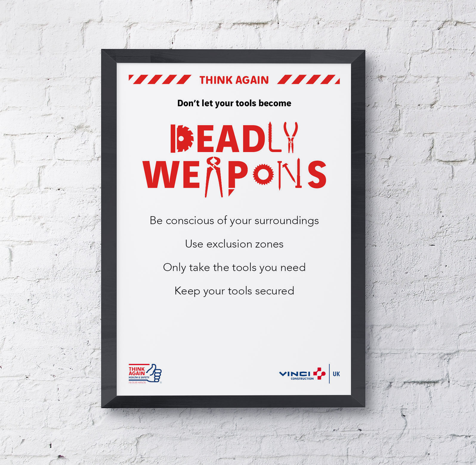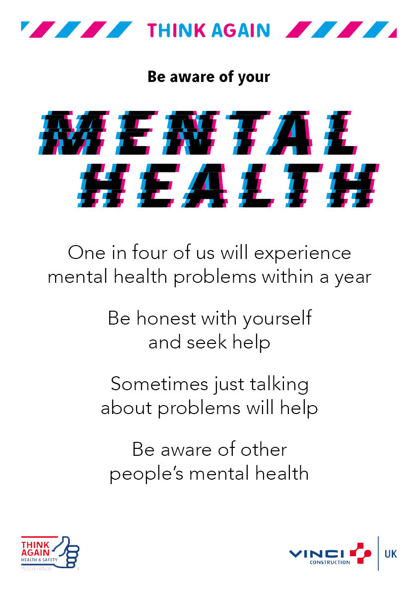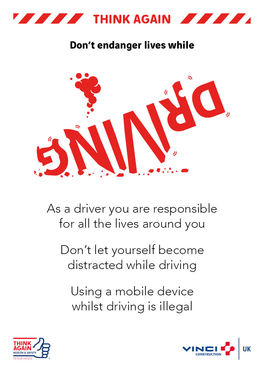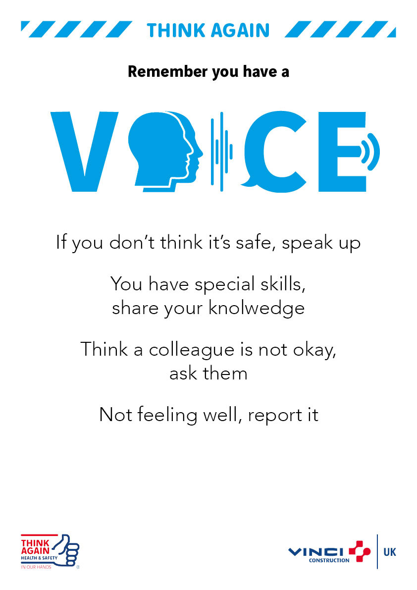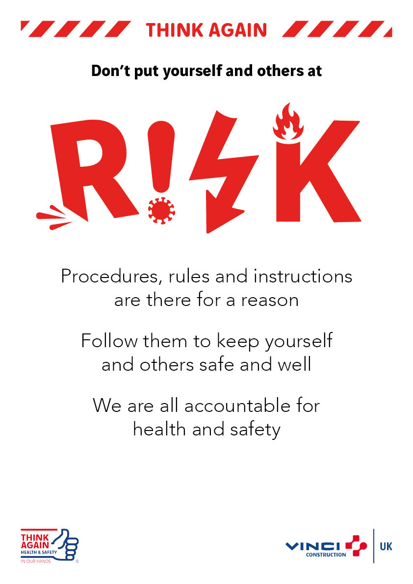
These posters were part of the ‘Think Again’ campaign and were designed to provide health and safety information for all staff across various office and construction sites.
To catch the attention of the viewer I decided to use a white background with the title displayed in a creative and eye catching way. Each of the posters has a bespoke title design, using imagery of the subject matter to help understand the information.
I used a bold font for the first line of text to also help catch the attention of the viewer. When placed between the coloured header and title, the font thickness highlights the text further. The colour used for each poster reflects the subject matter.
Adding a ‘hazard’ tape either side of the ‘Think Again’ logo helps indicate the severity of the subject matter, and when used against the white background it also helps attract the attention of passers by.