

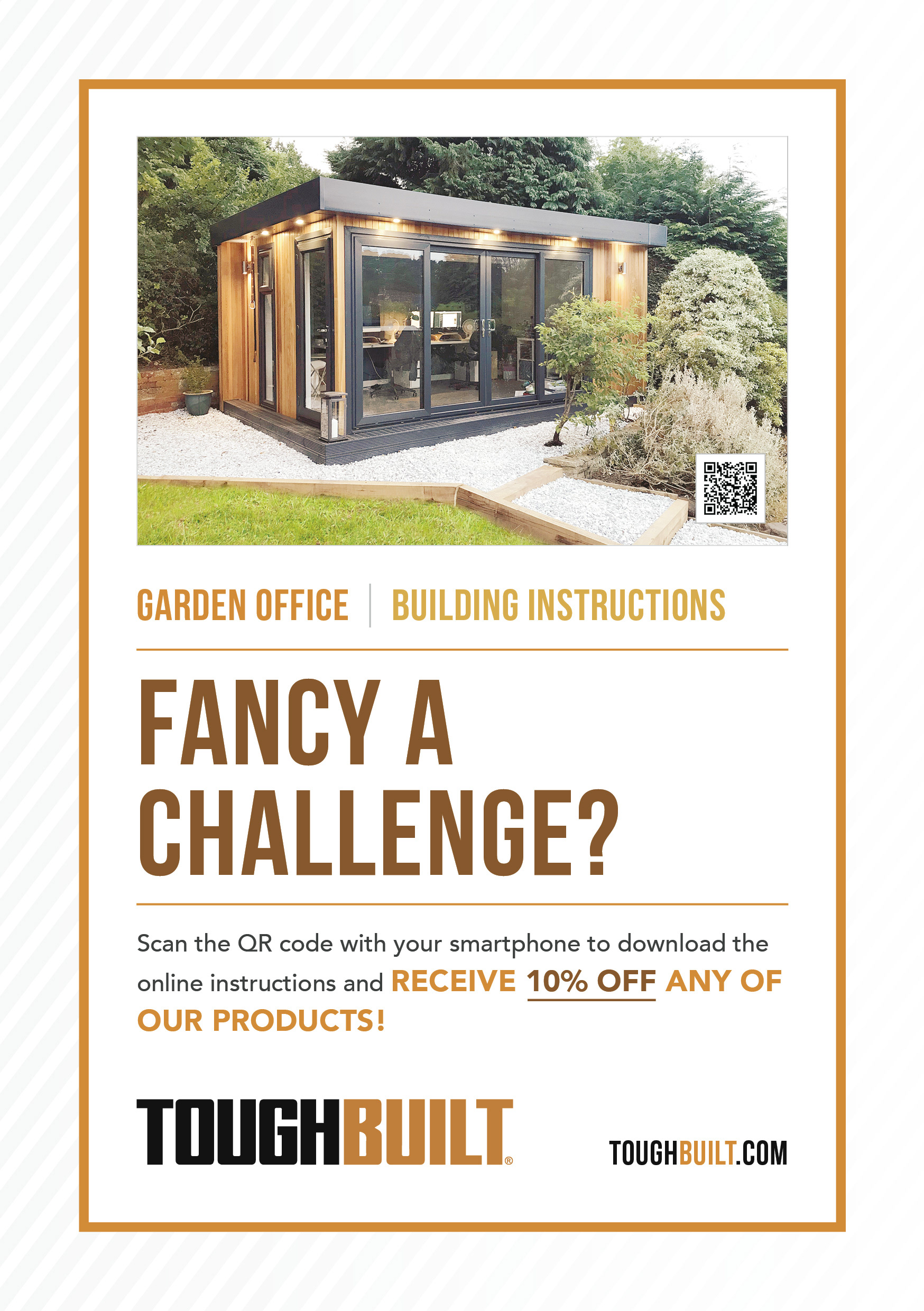
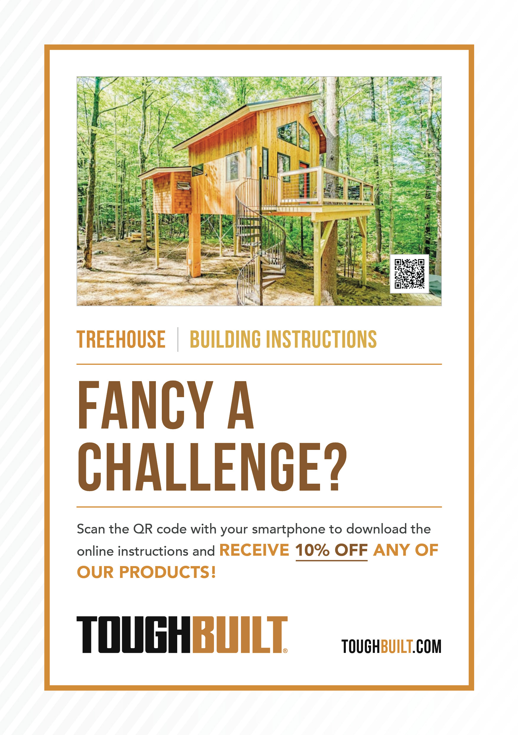
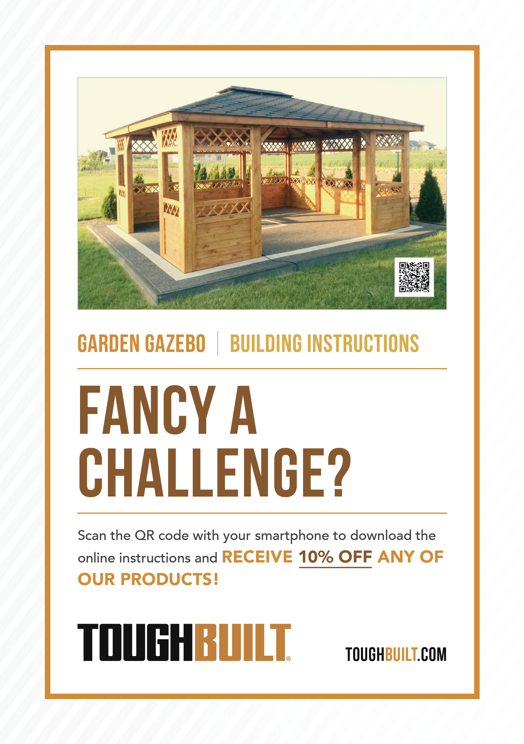
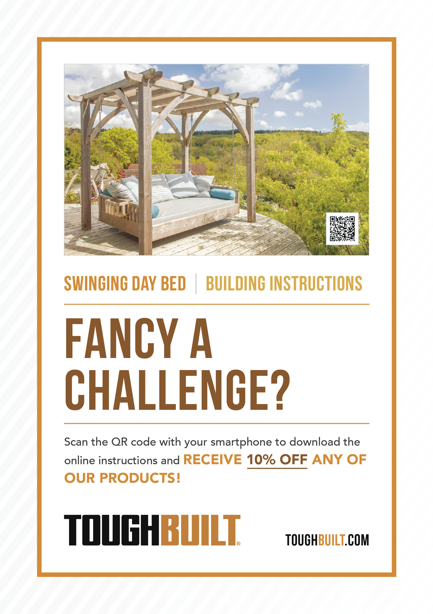
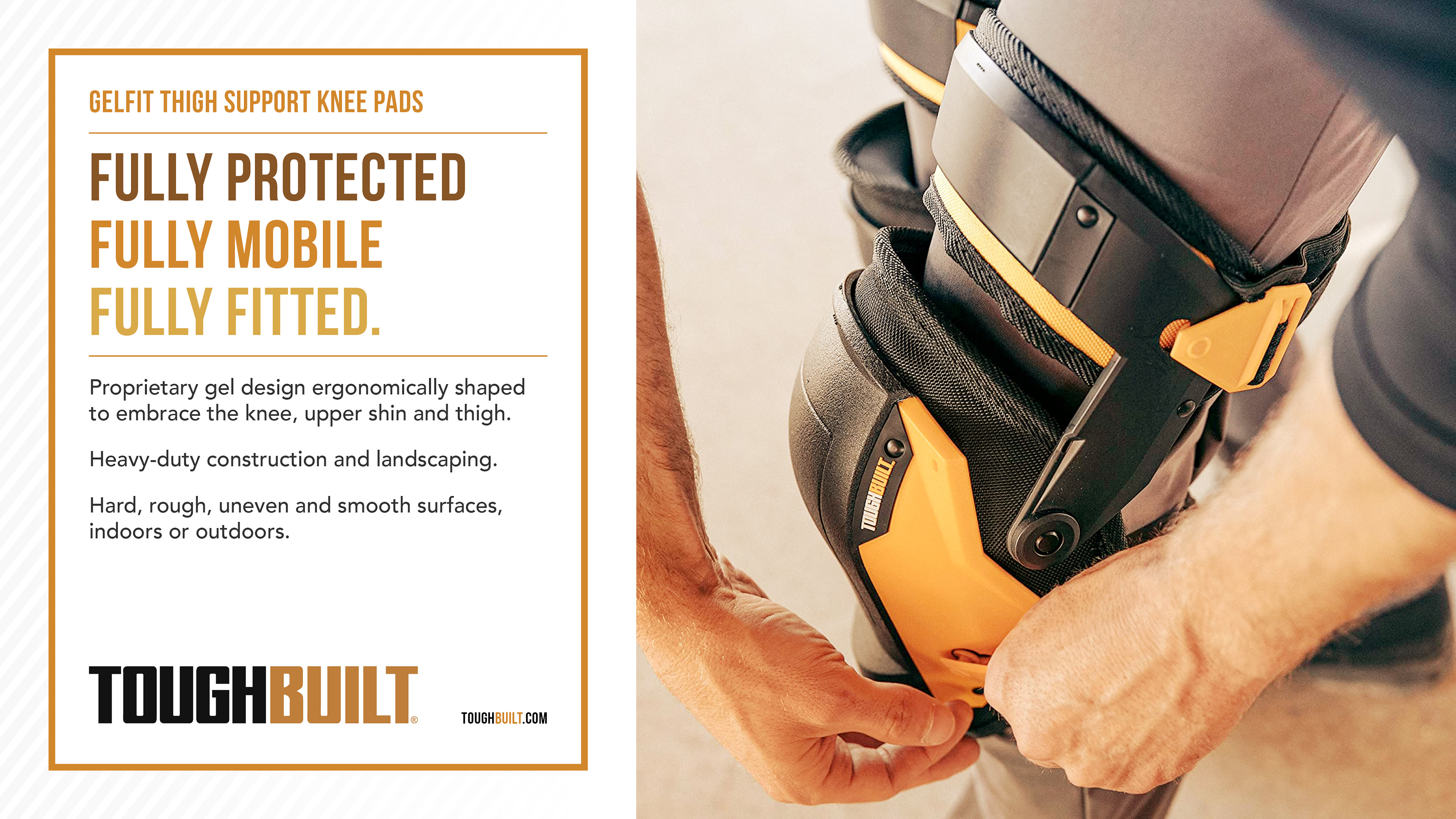
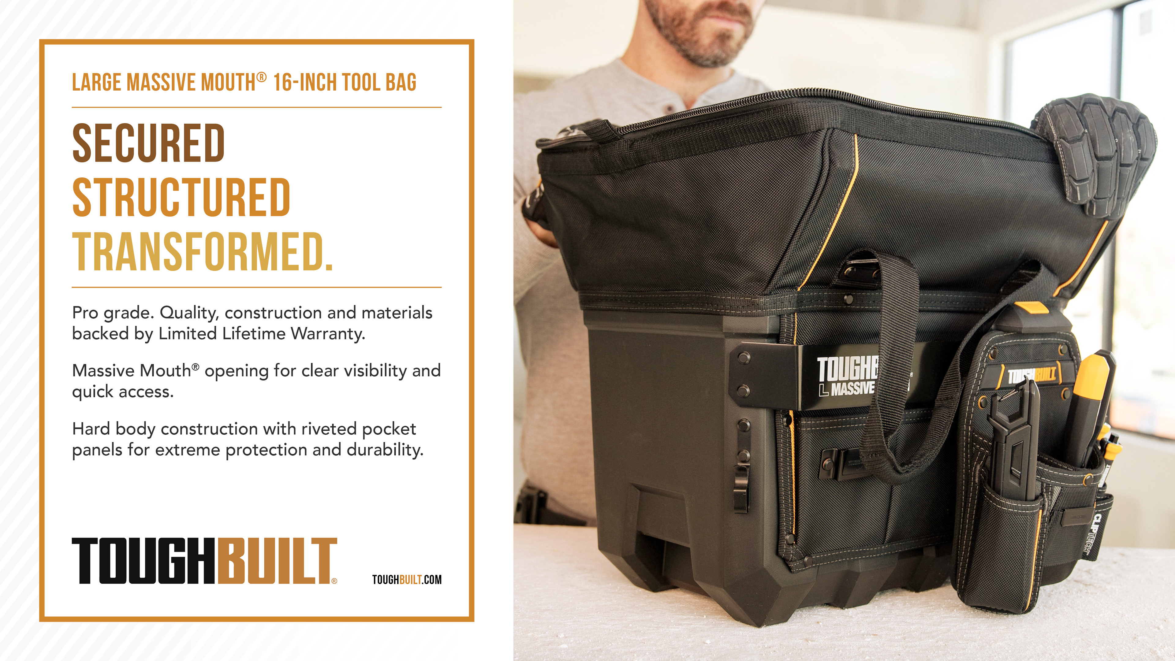
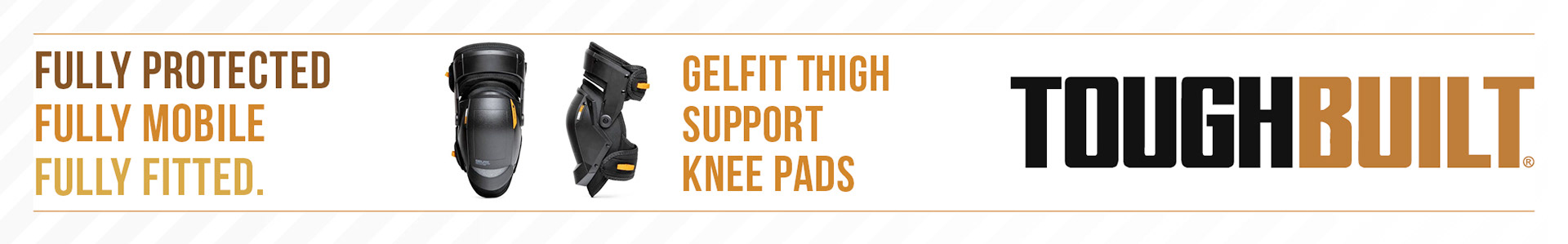
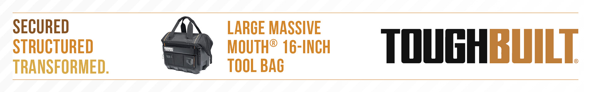
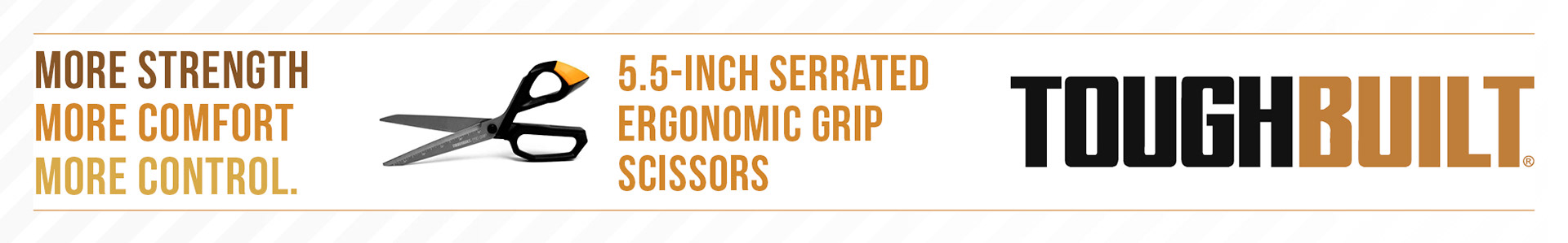
Having fully researched the ToughBuilt brand I created a new visual identity to advertise their products whilst honouring their brand.
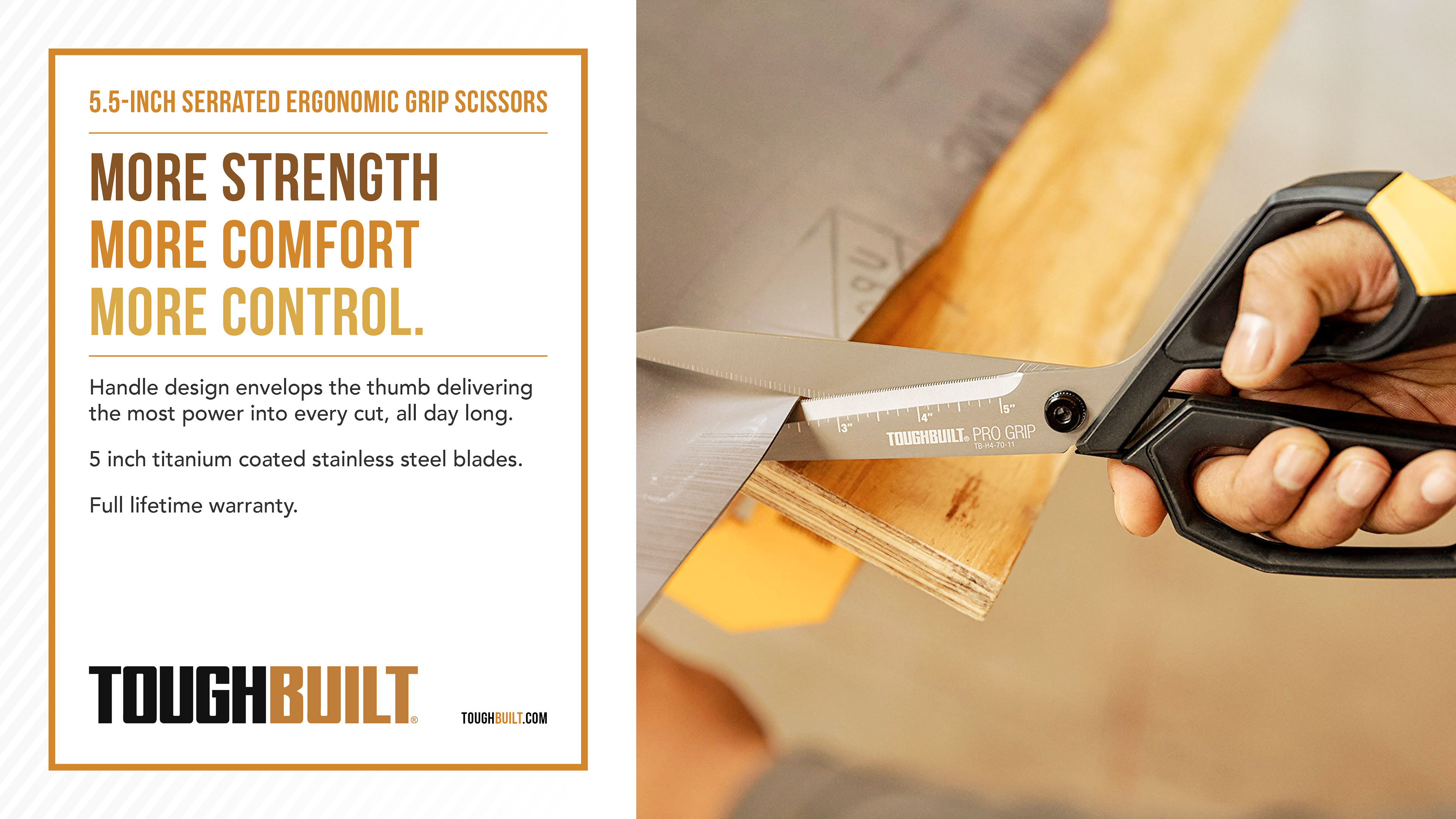
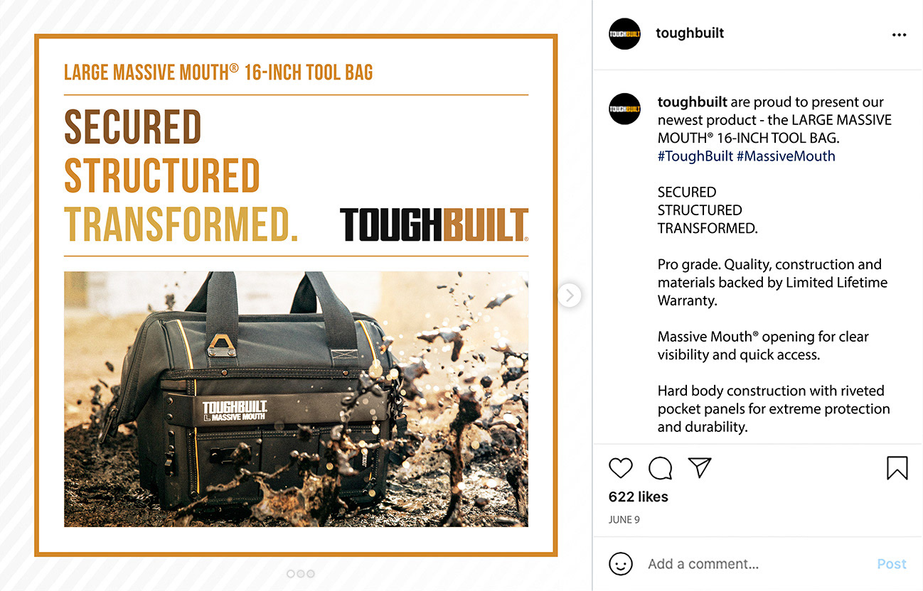
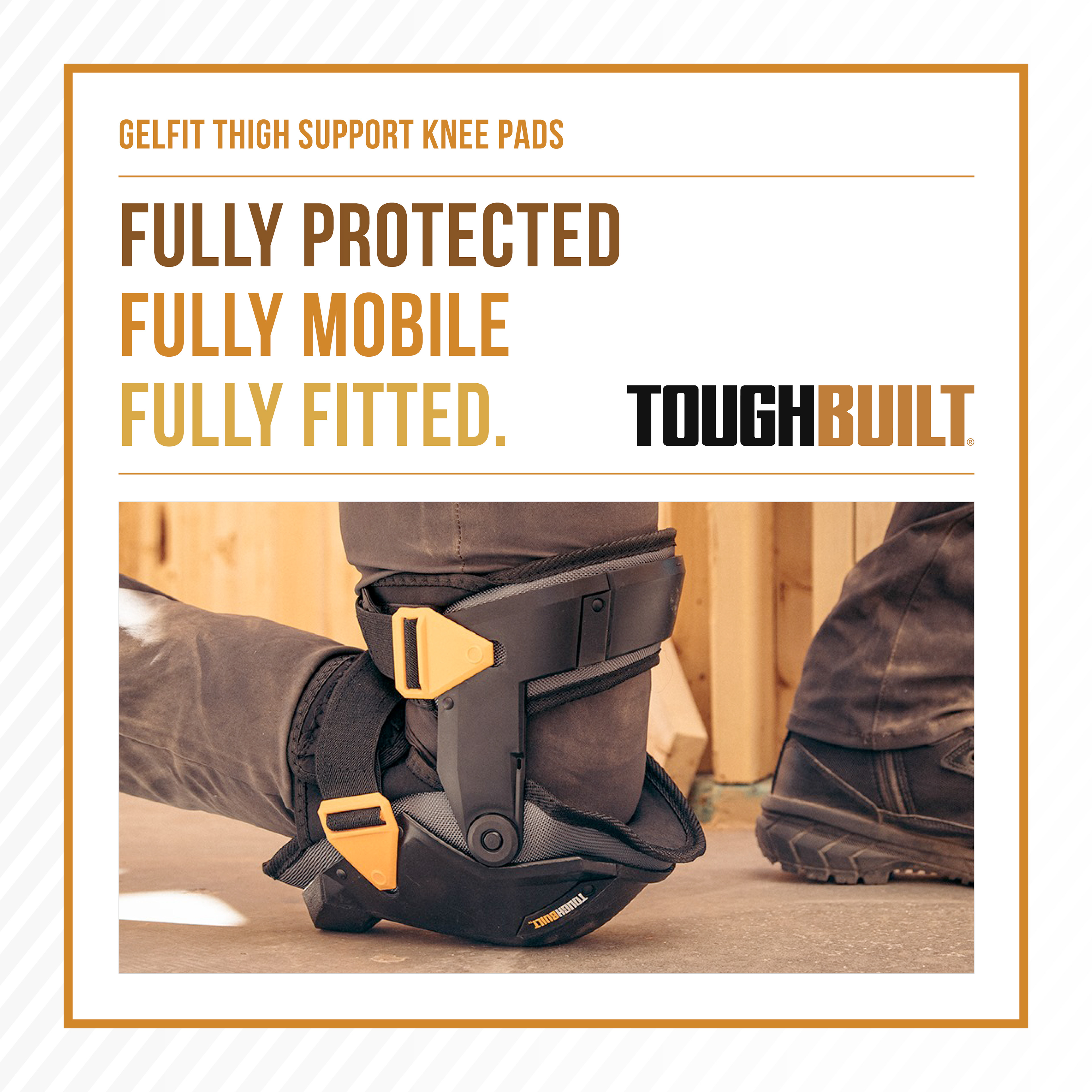
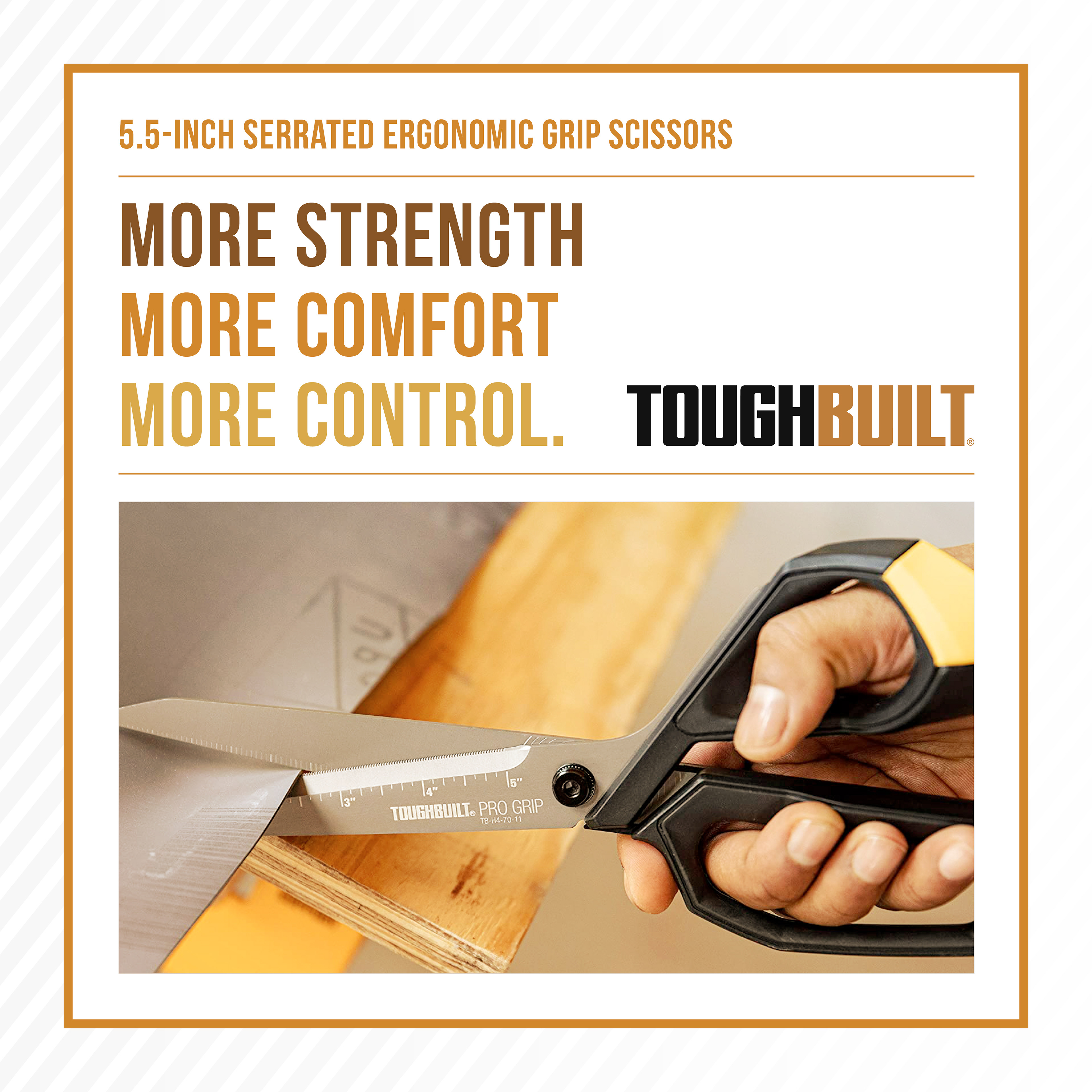
I crafted three lines of text for each product to describe what the products are at their core and to instantly inform the viewer.
I used the harmonious colours brown, orange and yellow, to compliment ToughBuilt’s brand colours, black and orange, whilst still allowing ToughBuilt’s logo to always stand out.
I used a simple design to allow the brown, orange and yellow lines of text to draw the attention of the viewer, whilst using a thin orange frame to centralise the focal point.
To add depth and to let the box of text and product have more visibility, I created a lined background that fades into the corner. The pattern is reminiscent of carbon fibre that is known for being a strong and safe material.
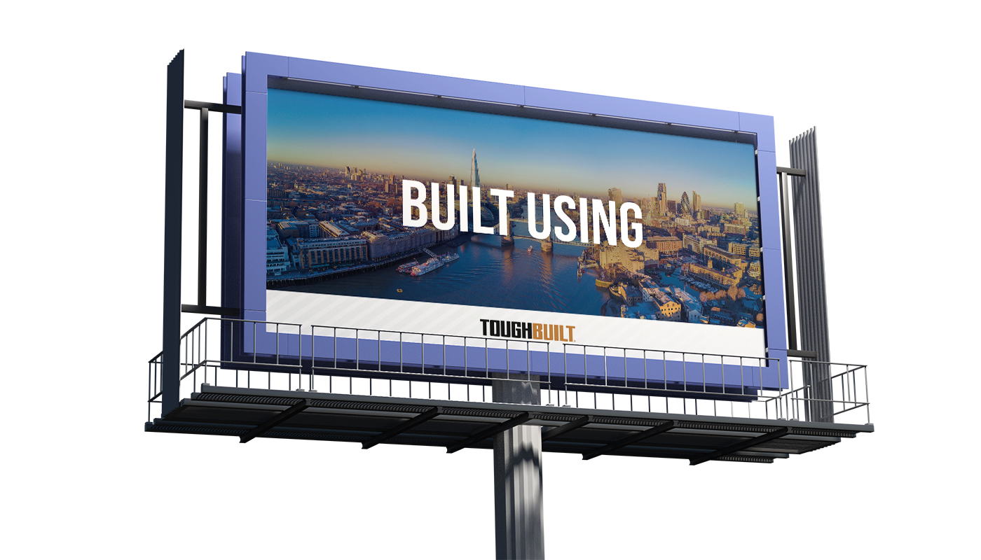
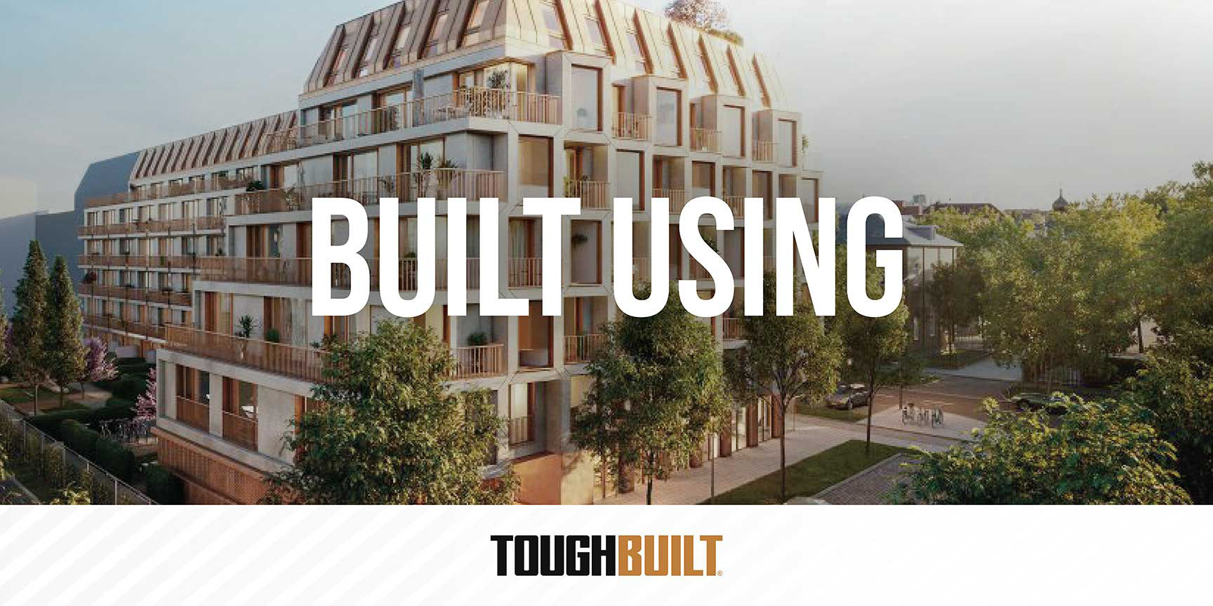
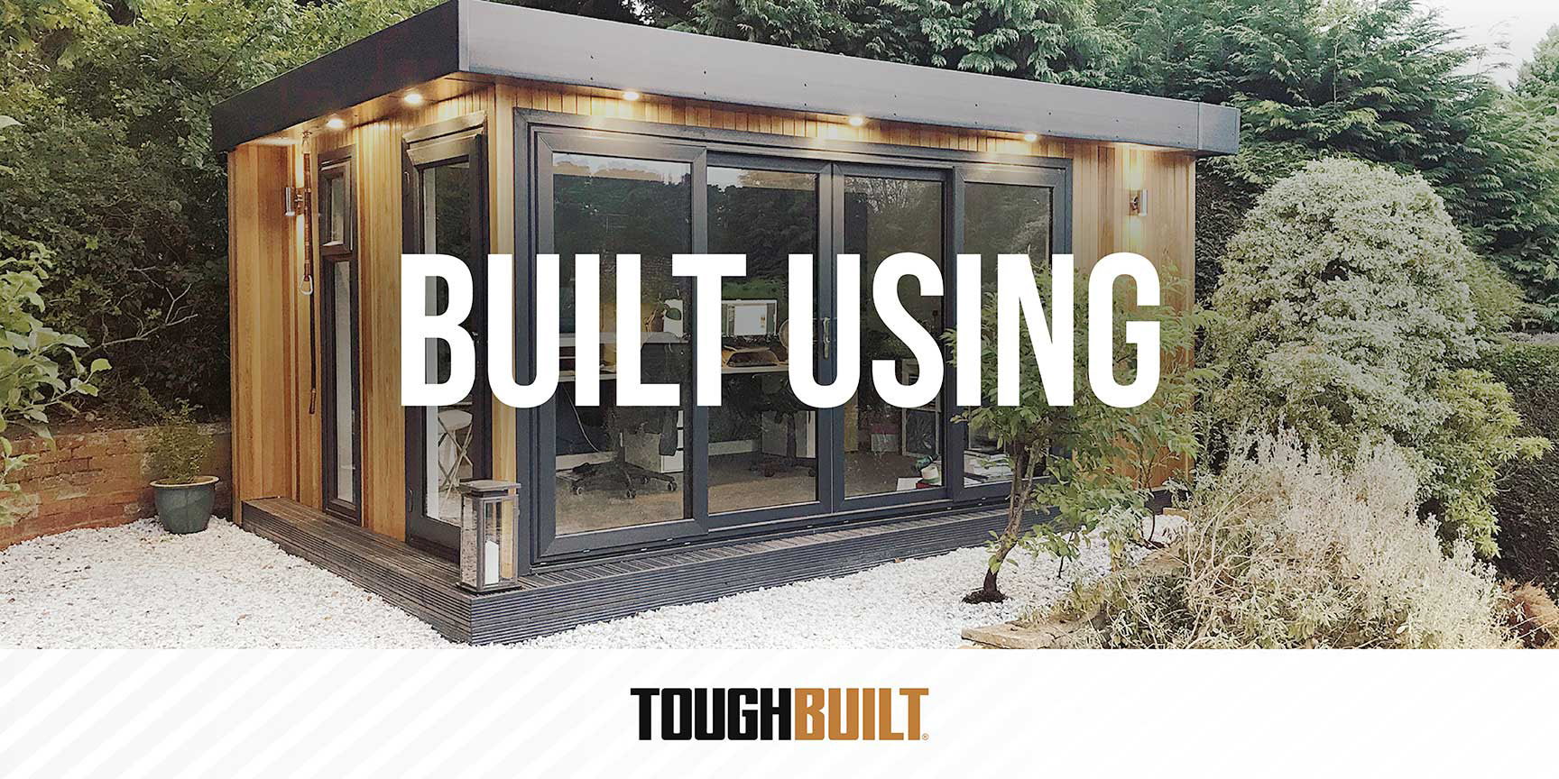
Billboard designs

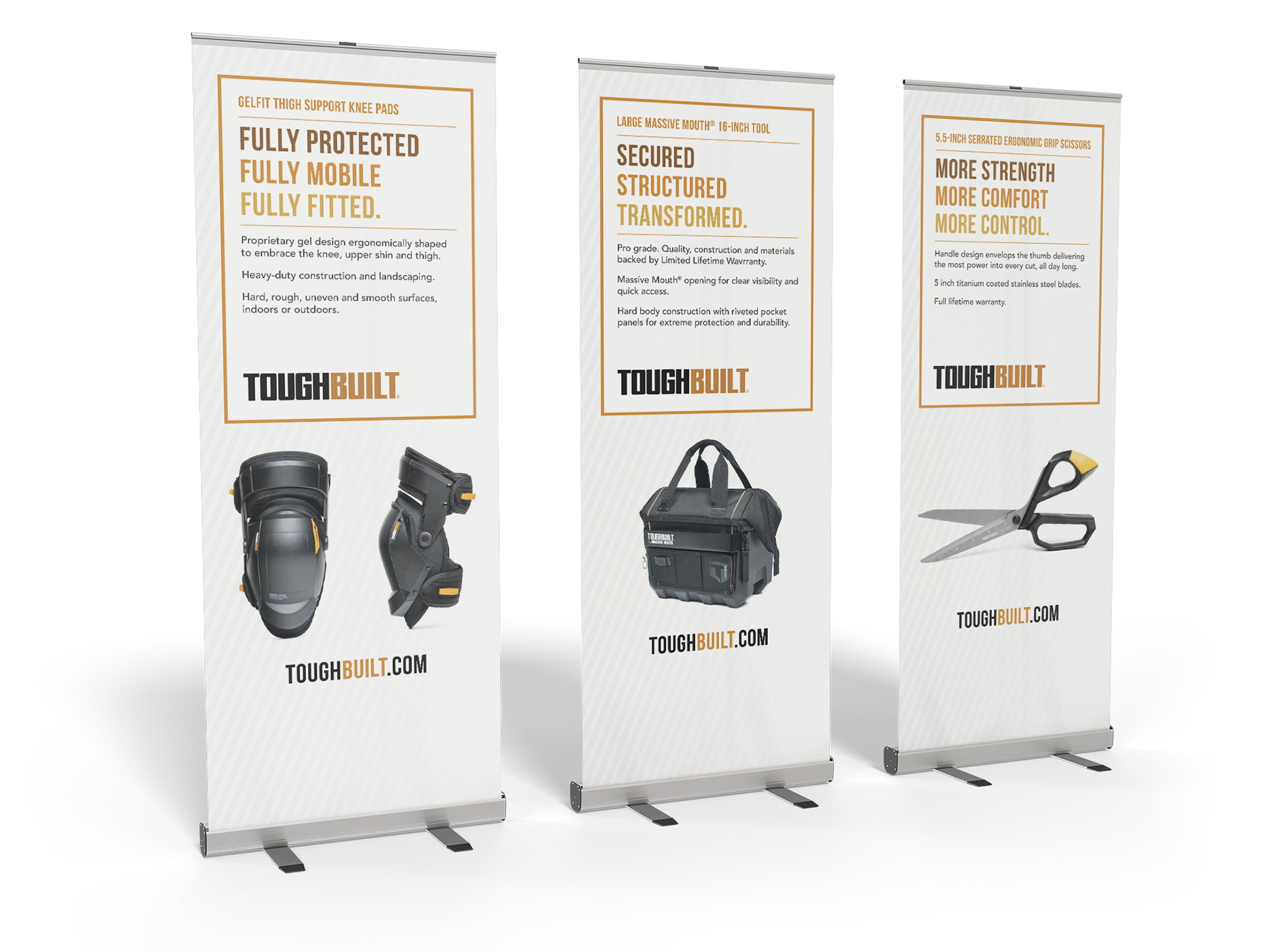
Pull up banners
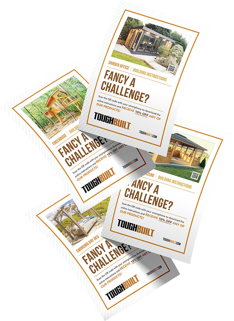
Flyers
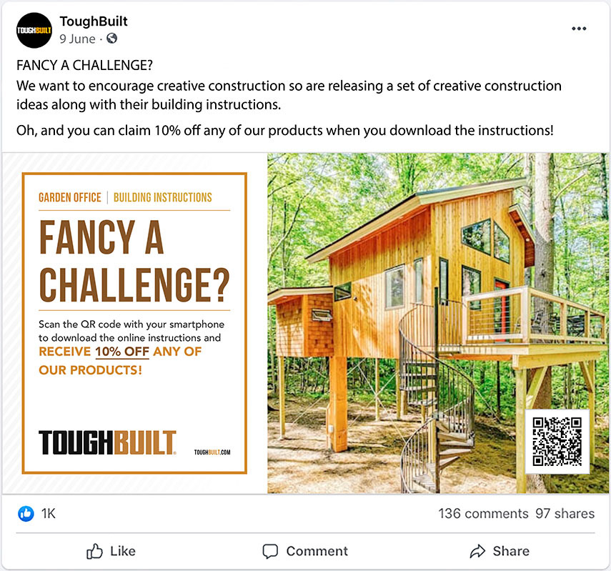
Facebook post
Instagram post
Web banners
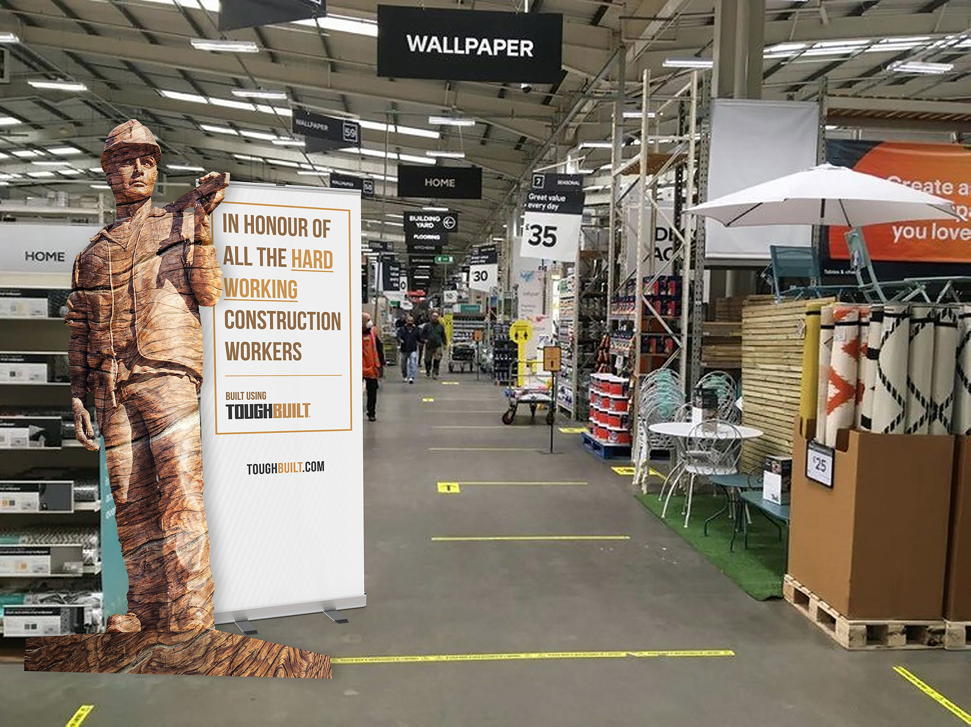
In store marketing concept
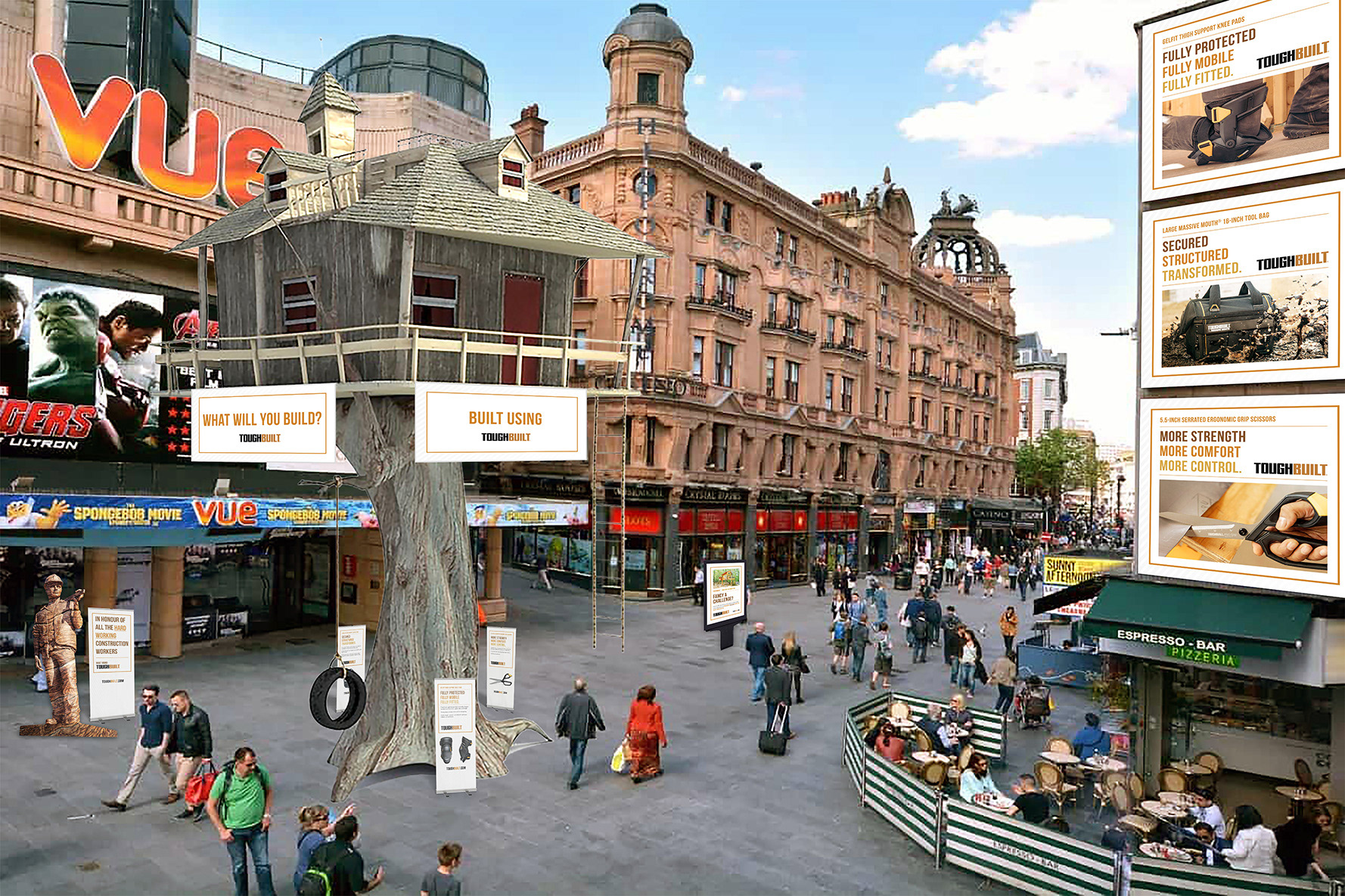
Marketing concept