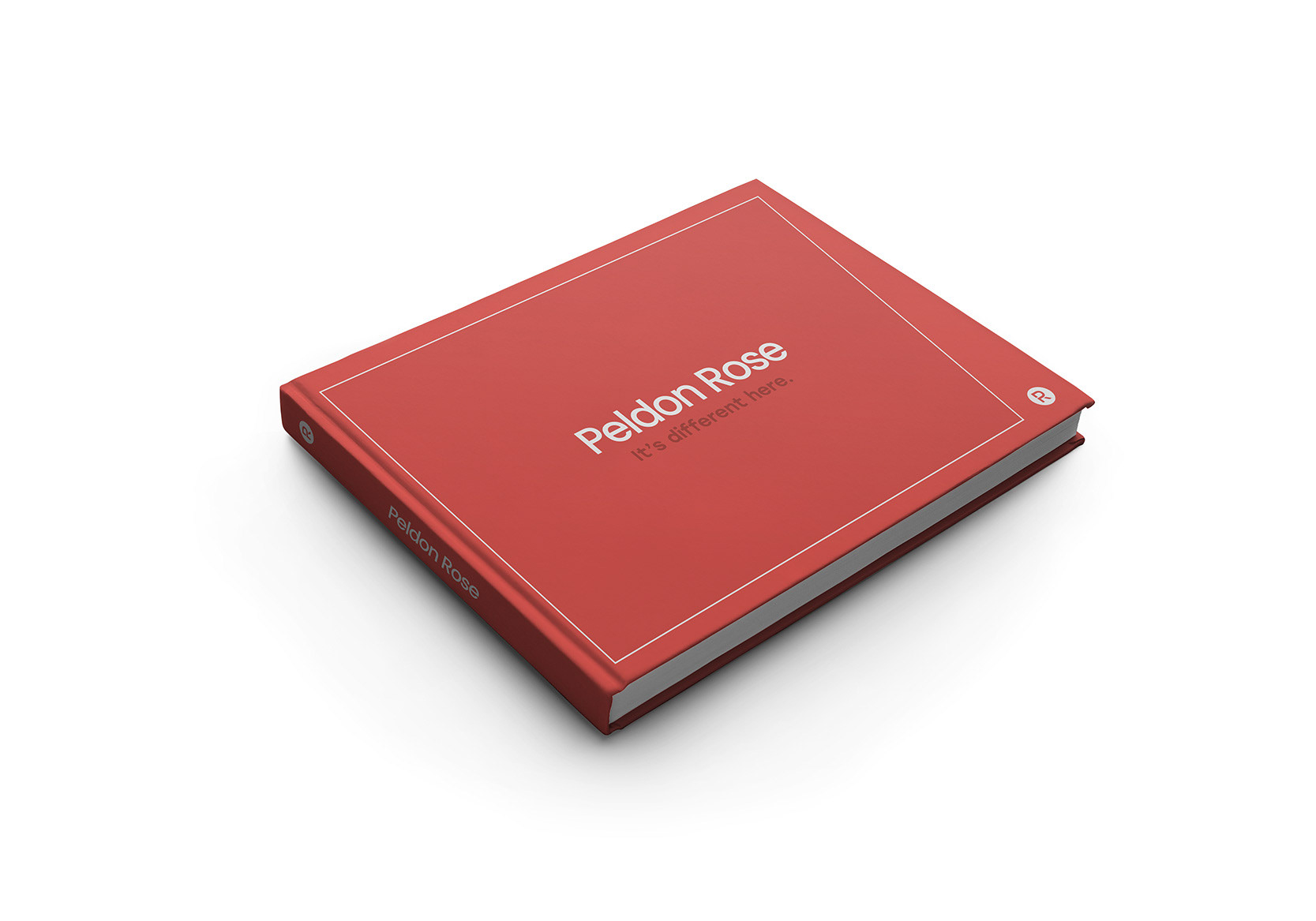
The front cover design for the credentials document emphasises Peldon Rose’s tagline ‘It’s different here’, whilst making use of the asymmetrical rectangle that is predominant on Peldon Rose’s other documents and online website.
This shape represents going against the traditional and the ability to go along a different path to create unique experiences.
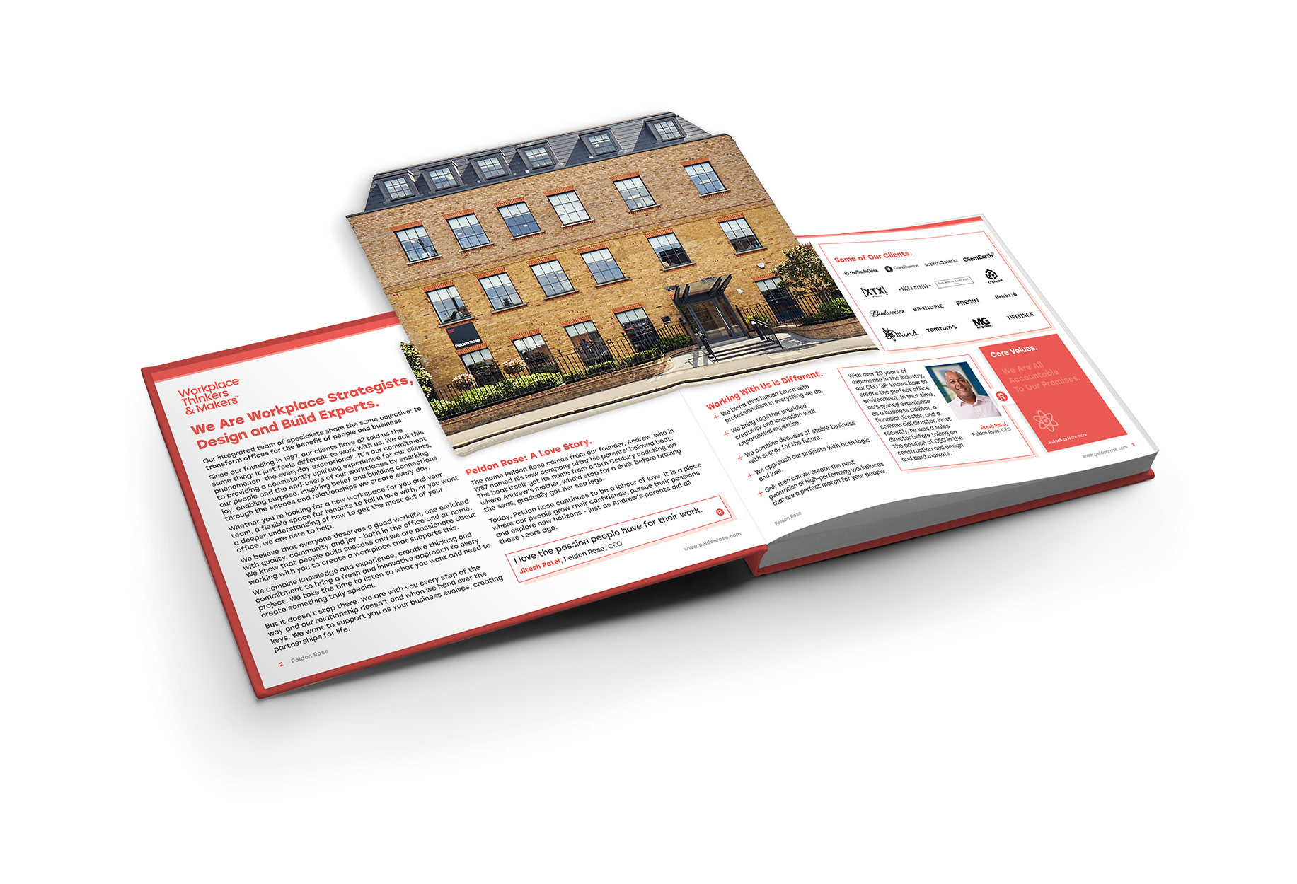
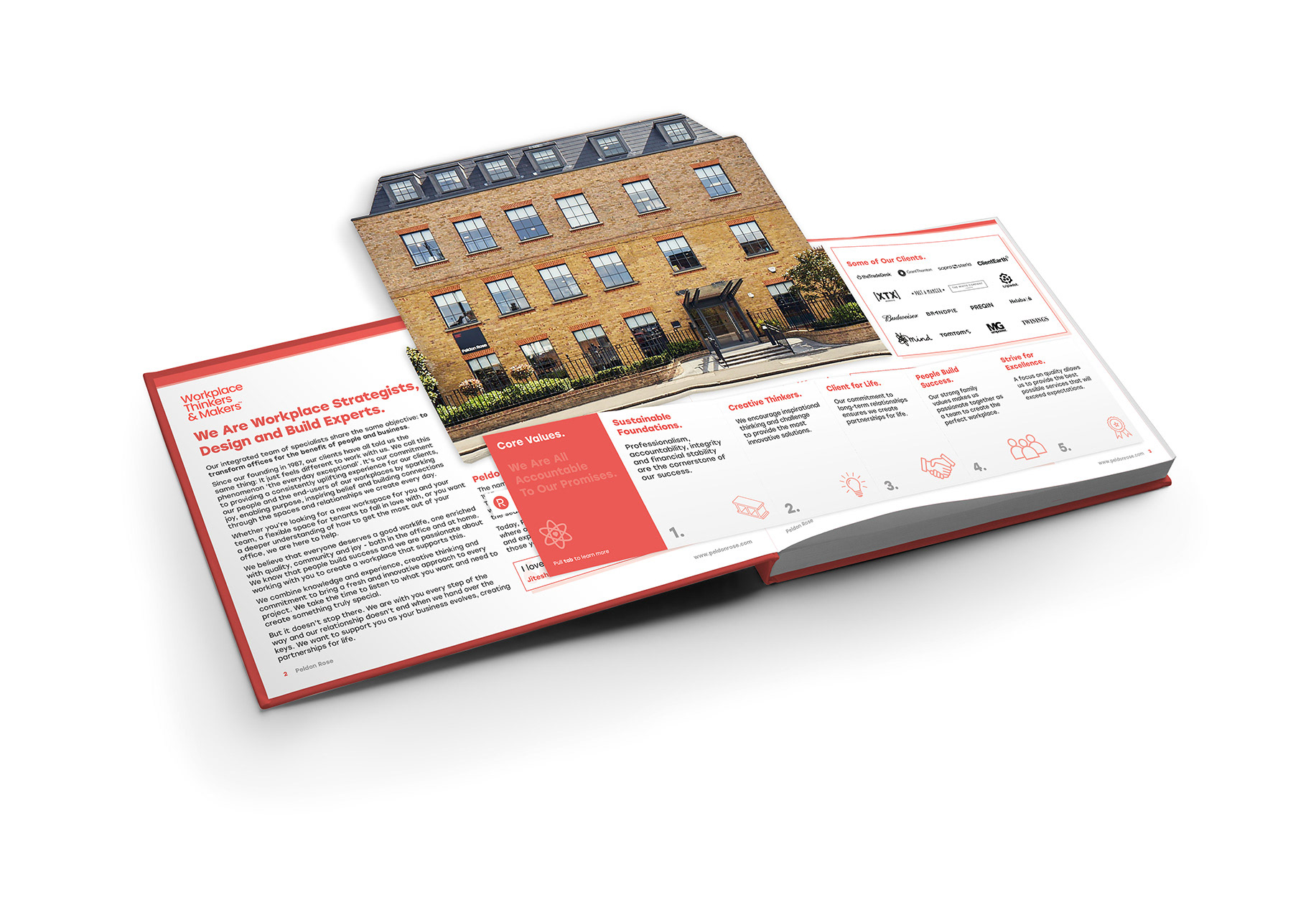
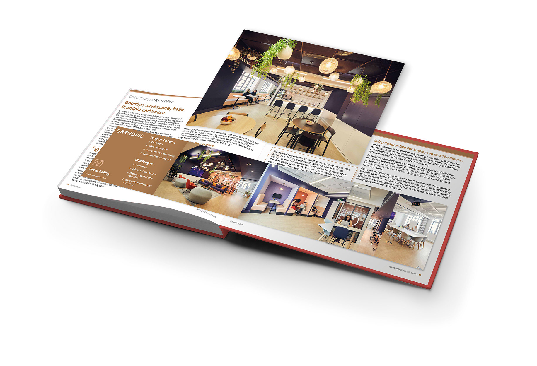
The document would be a hardbound book with fabric used for the material, giving the reader a positive sensation when handling the document.
Peldon Rose’s website communicates a wealth of information about the company, their services and in-depth projects they have worked on.
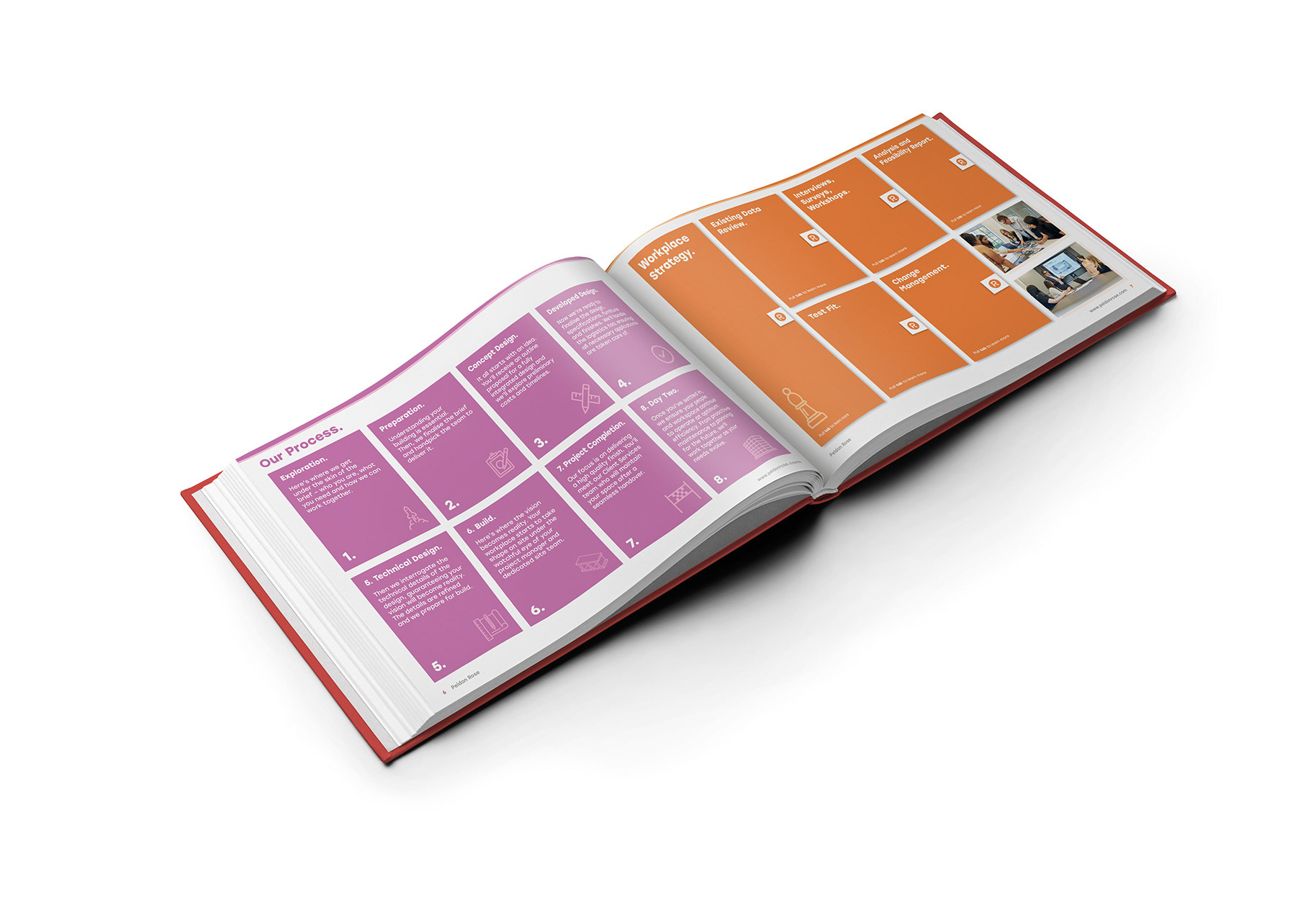
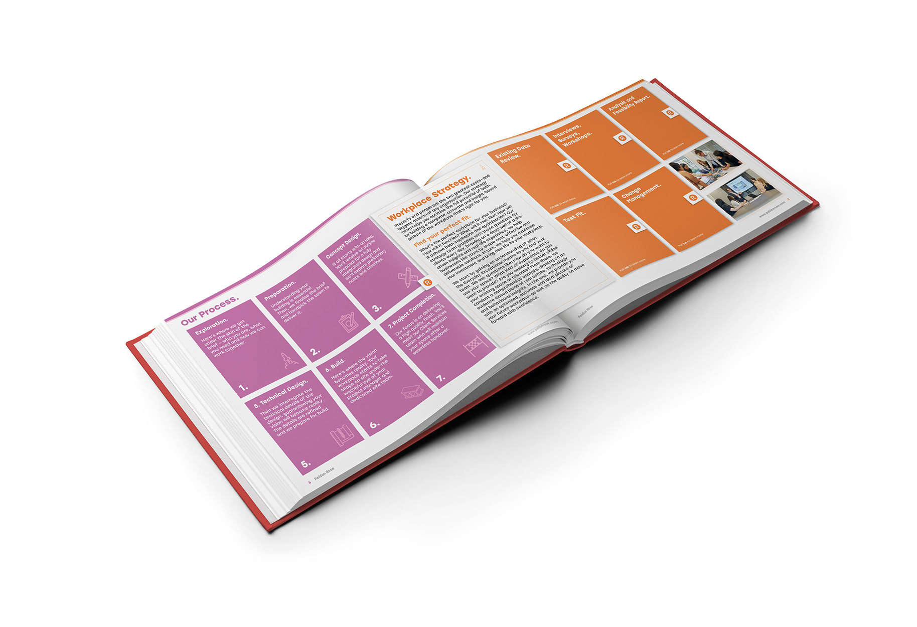
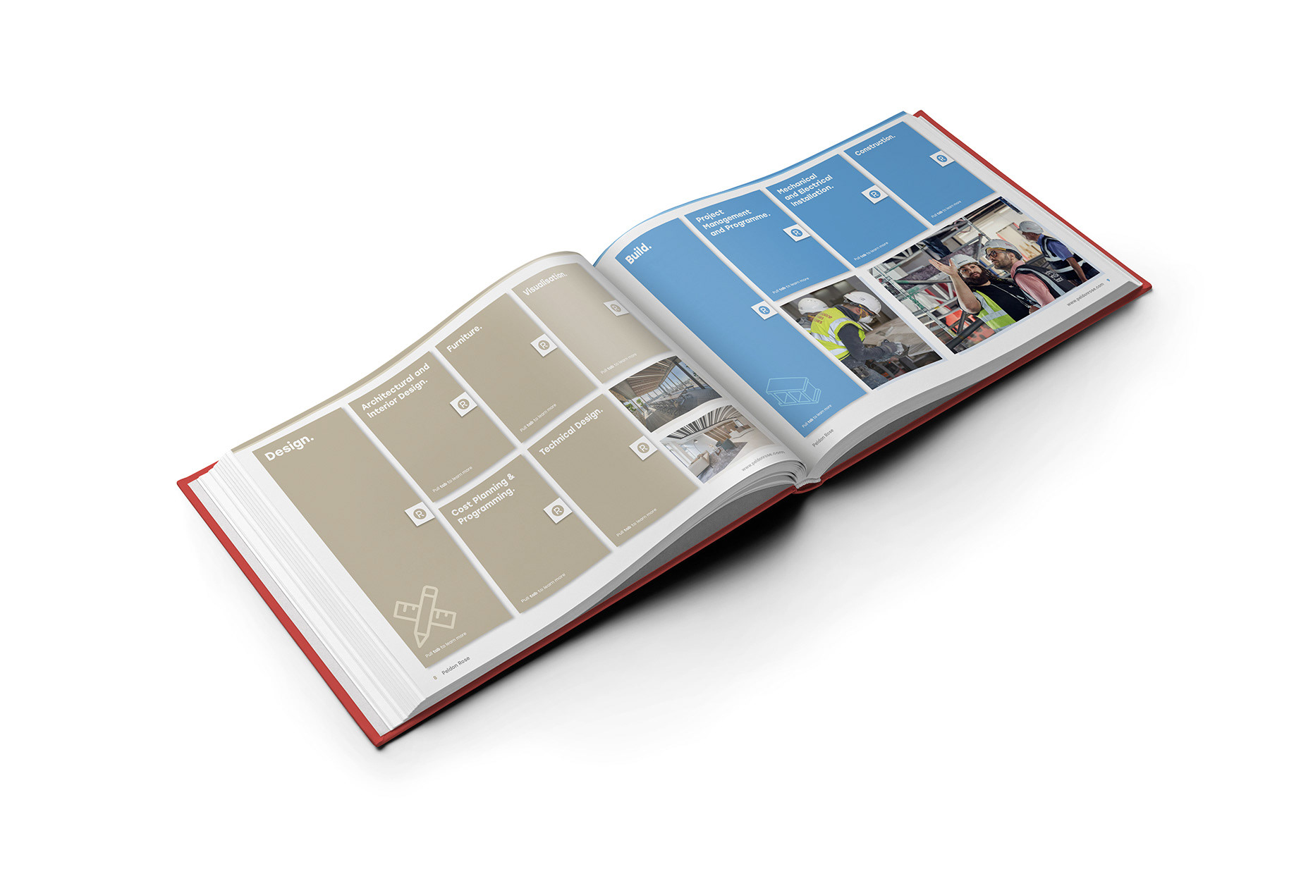
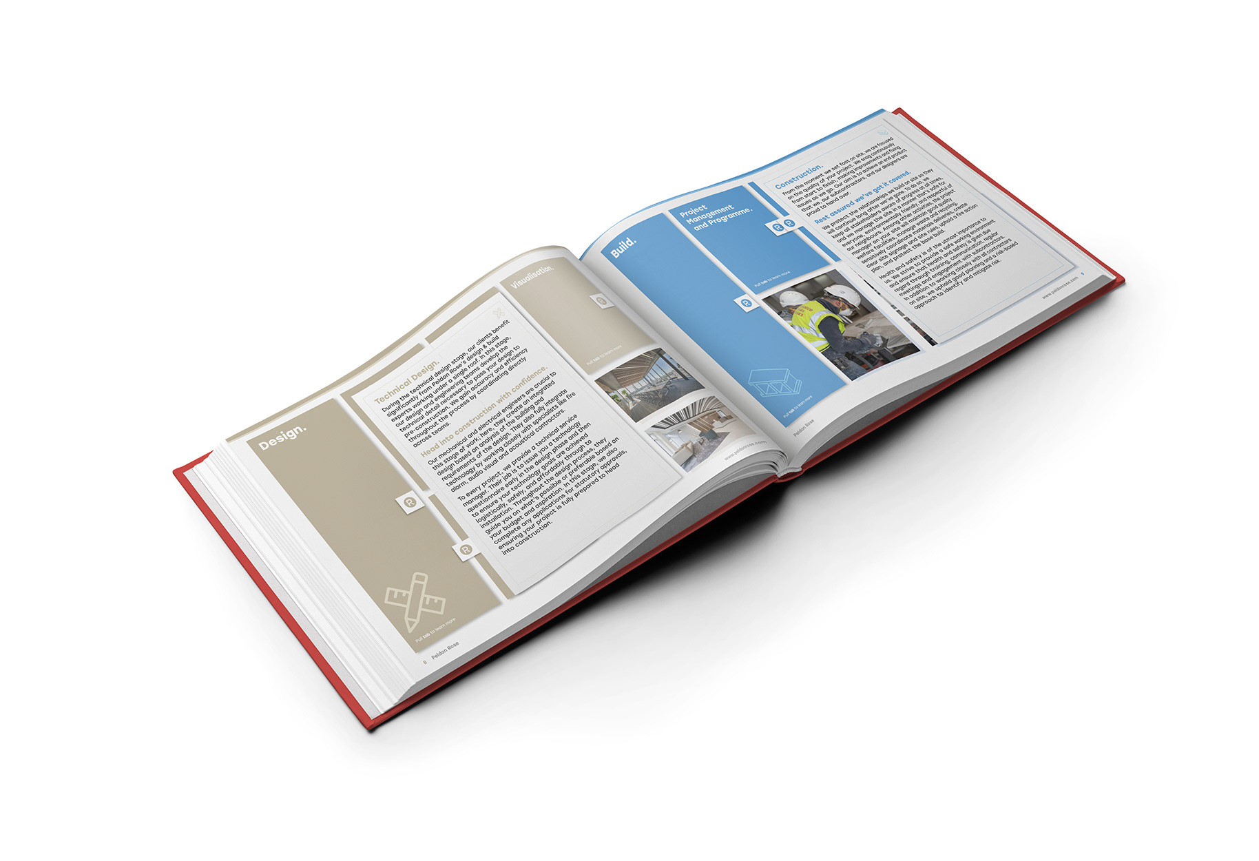
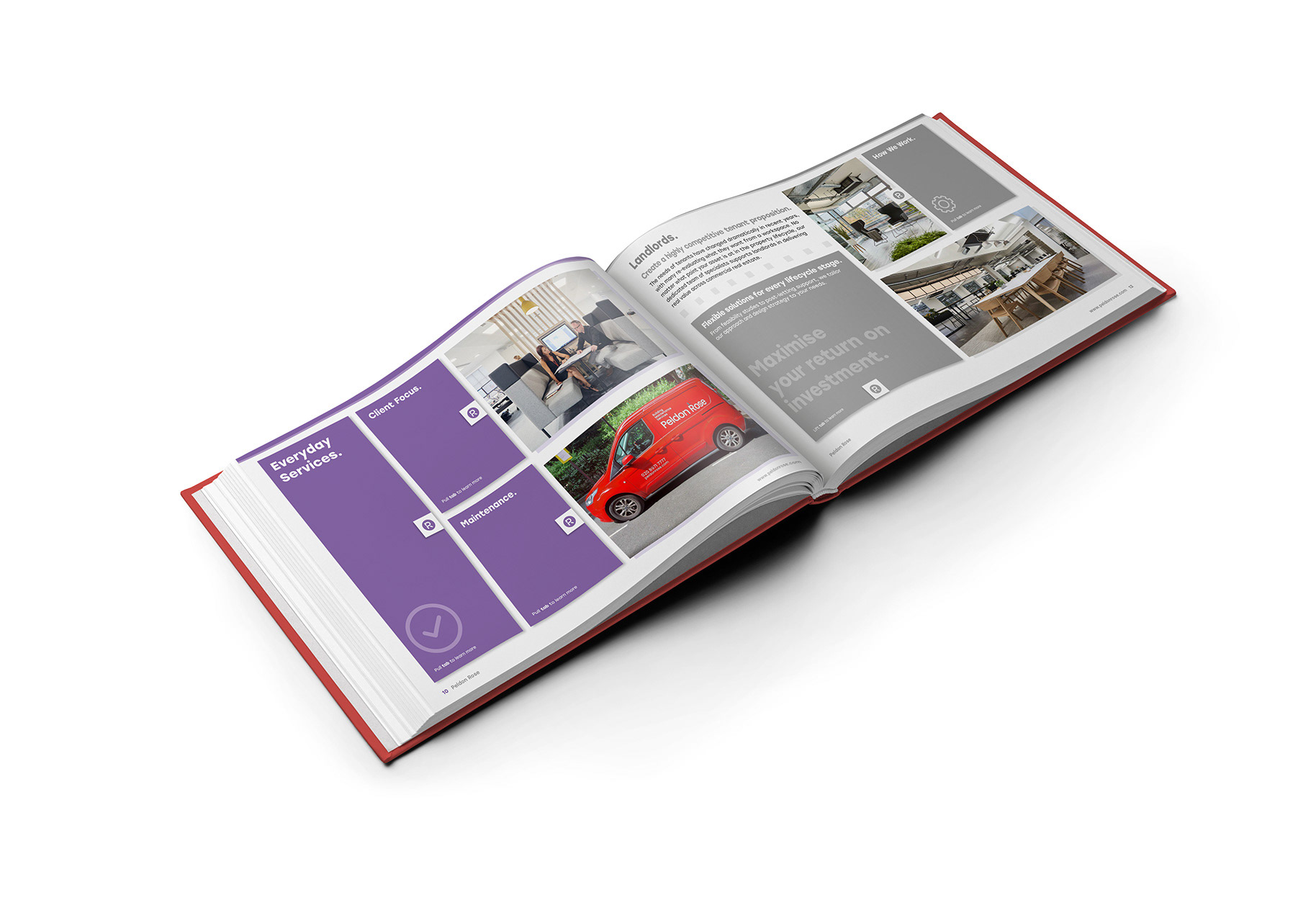
Having a maximum of 16 pages to communicate to a potential client who Peldon Rose are and what they offer means that only a certain amount of information can be added to the document, resulting in some information potentially being lost, and to a potential subsequent loss of clients.
My aim was to replicate the information from the website into a 16 page document.
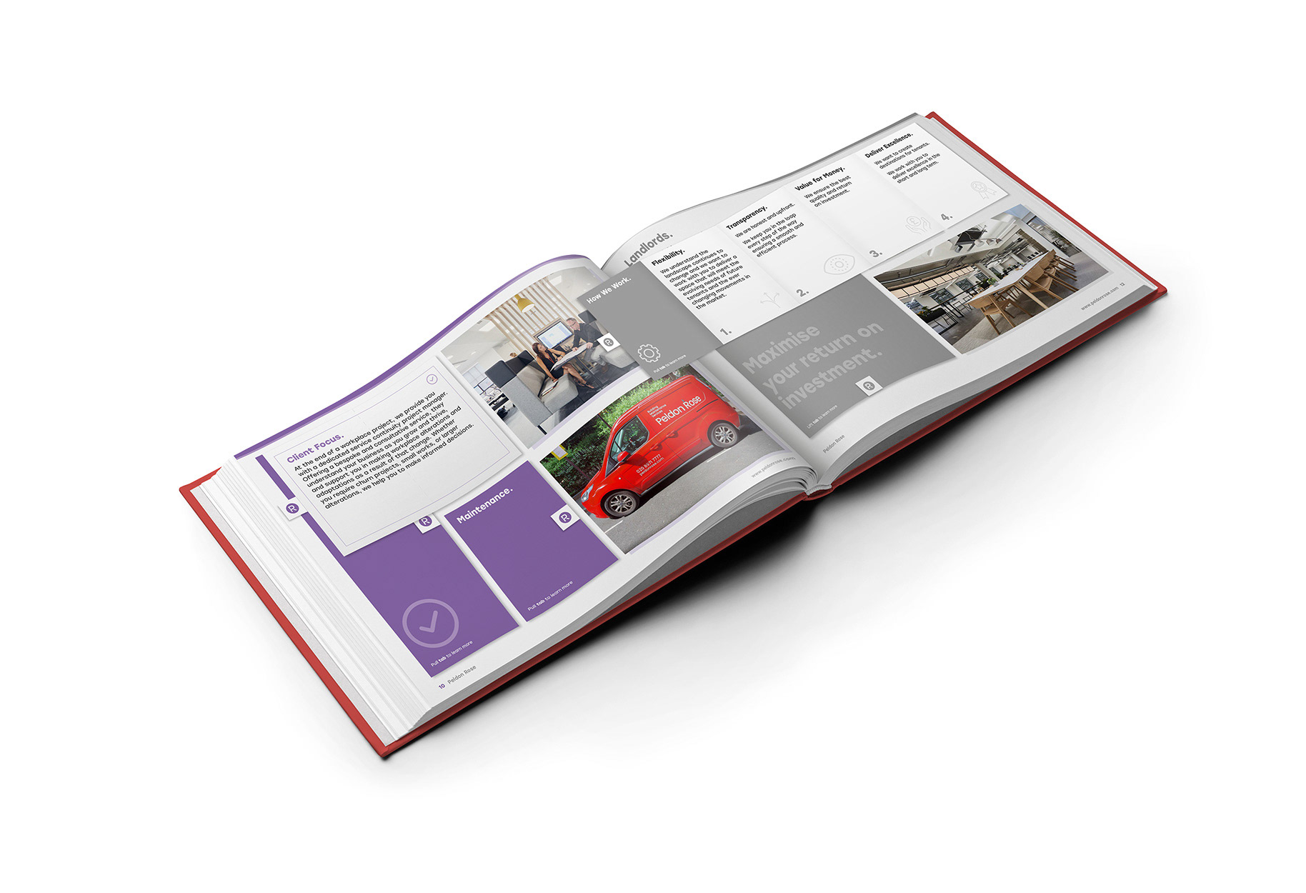
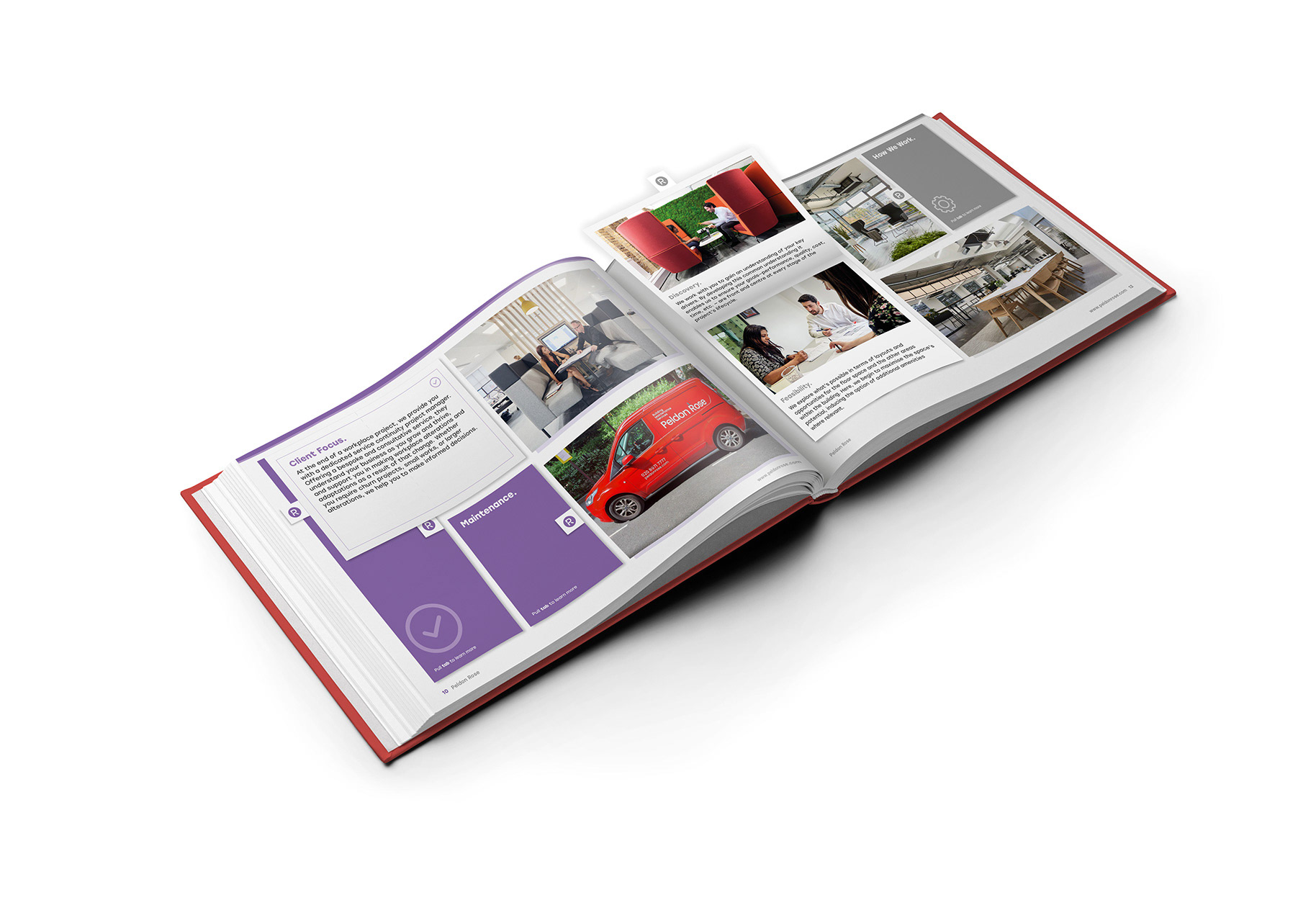
To achieve this, I felt using interactive elements, like those found in a ‘pop-up’ book, would achieve two points: one, to allow for more information to be presented on the page(s) than would typically be contained to a static environment, and two, to elevate the look, resulting in a more impactful and memorable experience for the client.
Below are some examples from the brochure.